Metrics
Browse every OpenTelemetry metric Maple has received, then chart one with an aggregation, a filter, and a breakdown by attribute.
The Metrics page lists every metric Maple received in the selected time range, with its type, emitting service, and data point count. Open a metric to chart it: choose an aggregation, filter by attribute, break it down by a dimension, and add the chart to a dashboard or turn it into an alert.
What data it needs
Metrics arrive over OTLP from an OpenTelemetry SDK or collector, or from a Prometheus scrape target. Maple stores four OTLP metric types:
| Type | Badge | Examples |
|---|---|---|
| Sum | Sum | Request counters, bytes sent. Monotonic or not. |
| Gauge | Gauge | Memory in use, queue depth. |
| Histogram | Histogram | Request duration with explicit buckets. |
| Exponential histogram | Exp Hist | Request duration with exponential buckets. |
OTLP Summary metrics are not stored. The Prometheus scraper converts summaries into sums and a quantile gauge before ingest.
The Service column and the service filter read the service.name resource attribute. Data point attributes become the dimensions you can filter and group by.
Browse metrics
The default time range is the last 24 hours.
Four cards at the top count metrics by type: Sum Metrics, Gauge Metrics, Histogram, and Exp Histogram. Each shows its data point count and number of unique metrics. Click a card to filter the list to that type. Click it again to clear the filter.
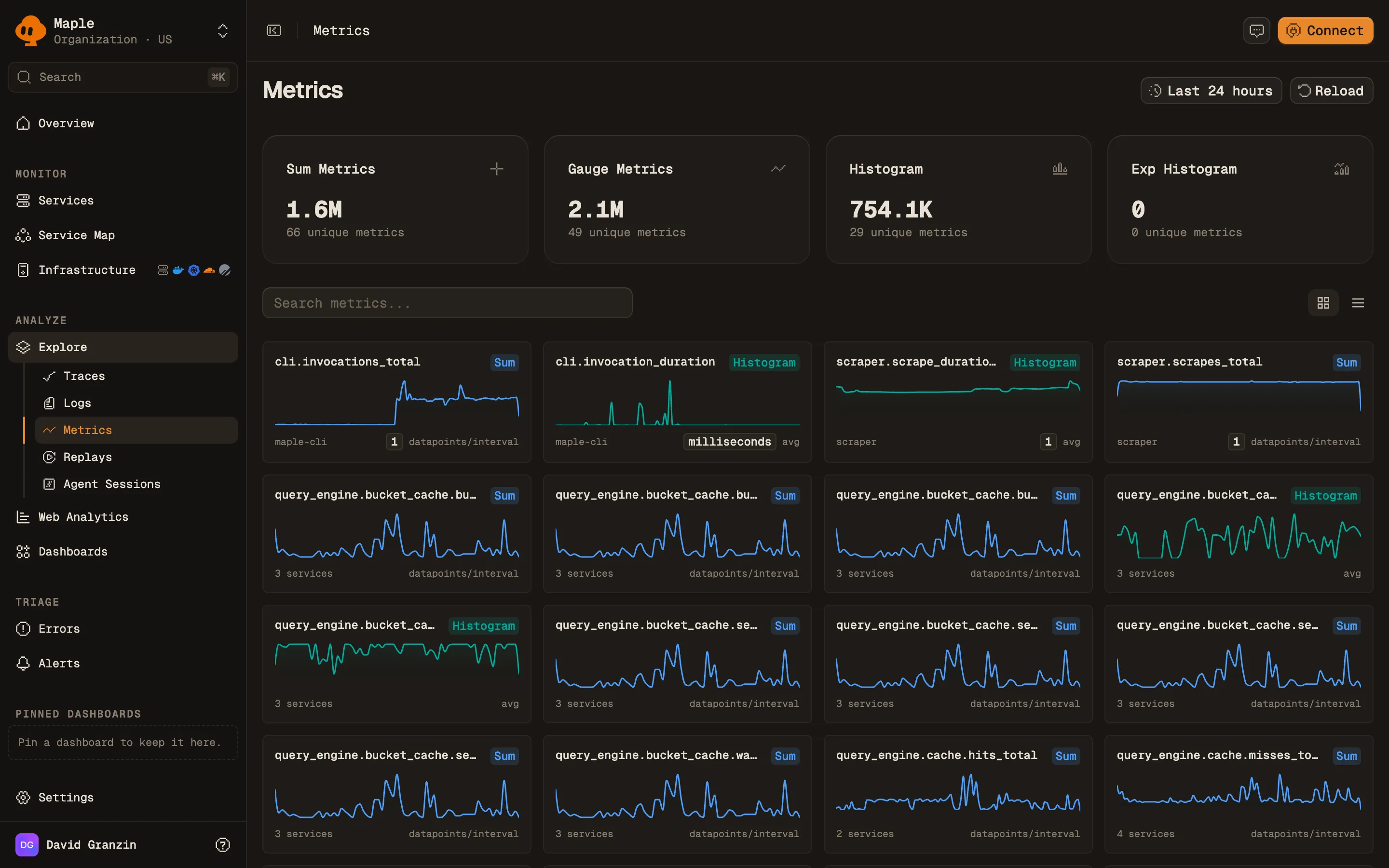
Type in Search metrics… to filter by metric name. Switch between Grid view (a sparkline card per metric, the default) and Table view. The table, headed Available Metrics, has these columns: Metric Name (with its description), Type, Service, Points, and Last Seen. Click Load more to page through long lists.
Click a metric to open it.
Chart a metric
The metric page has a chart, a breakdown panel, and a side panel of metadata.
Query controls above the chart:
| Control | What it does |
|---|---|
| Aggregate | How data points combine per time bucket. Monotonic sums offer rate (the default), increase, and sum. Other types offer avg, sum, min, max, and count. |
| Where | A filter on attributes, with autocomplete. For example http.route = "/api/users". |
| Group by | Everything (no breakdown), service.name, or any data point attribute as attr.<key>. |
| Every | The bucket size in seconds. Auto picks one from the time range. |
The chart header shows the query, such as rate(http.server.requests) by service.name, and the metric’s unit.
The Top values panel ranks values of one attribute. Choose it with Break down by… (default service.name). Click a bar to add that value to Where.
The side panel shows the type, unit, and whether a sum is monotonic. It also shows Datapoints in range, First seen, Last seen, how many services emit the metric, and each attribute key with its usage count.
Save and share
- Add to dashboard adds the chart to an existing dashboard, or creates one with Create & add.
- Create alert opens a new alert rule with this query filled in.
- Copy link copies a URL that restores the aggregation, filter, grouping, and step.
Query metrics from an assistant
The MCP server exposes the same data:
list_metrics: search metrics by name, service, or type, with unit, monotonicity, and volume.query_datawithsource=metrics: a time series or breakdown for one metric, with the same aggregations and grouping by service or attribute.
Troubleshooting
- “No metrics found”. No metric matched the search, type, or time range. Clear the search and widen the range.
- “No data for this metric in the selected range”. The metric exists but had no data points in this window. Widen the range, or check that the emitting service is still running.
- A summary metric is missing. OTLP summaries are dropped at ingest. Export histograms instead.
- “Not enough datapoints for a preview”. The metric has too few data points in range to draw a sparkline. Open the metric to see its values.
- Rates look wrong.
rateandincreaseapply to monotonic cumulative sums. For a gauge, useavgormax.
Next steps
- Build dashboards: combine metric charts with trace and log queries.
- Prometheus scraping: pull metrics from exporters.
- Uptime monitoring: alert on HTTP check metrics from the OpenTelemetry Collector.
- Services: latency and error metrics derived from traces.